
Mourier是Eric Mourier于1971年根据一套严格的规则设计的几何字母表。字体基于一个7 x 7单位的正方形,由未闭合的线条组成。铅铸字体的第一次也是唯一一次使用是在小册子《The Myth about Bird B》中,这是由Mourier 设计、Knud Holten(诗人)撰写的一本小册子。
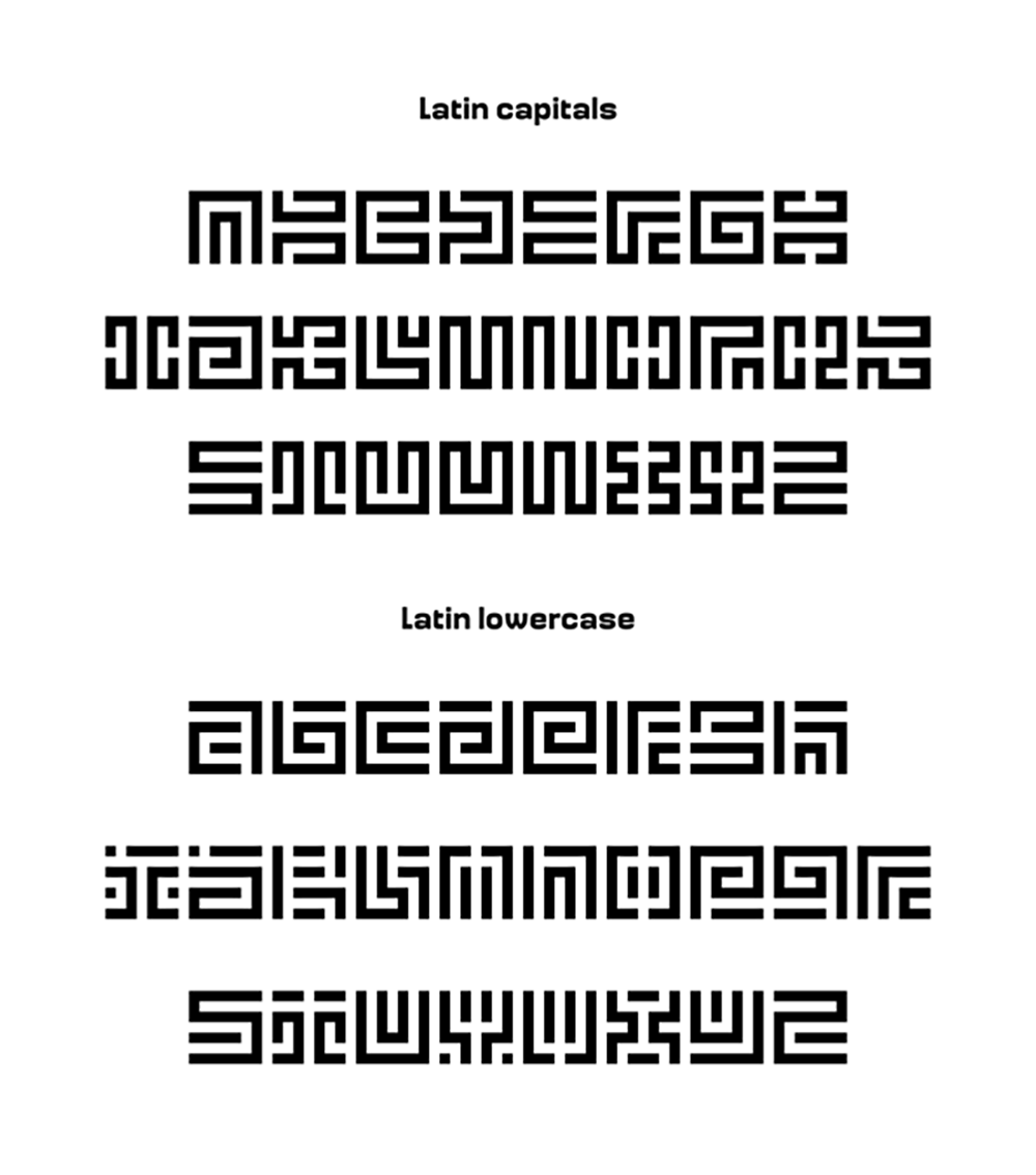
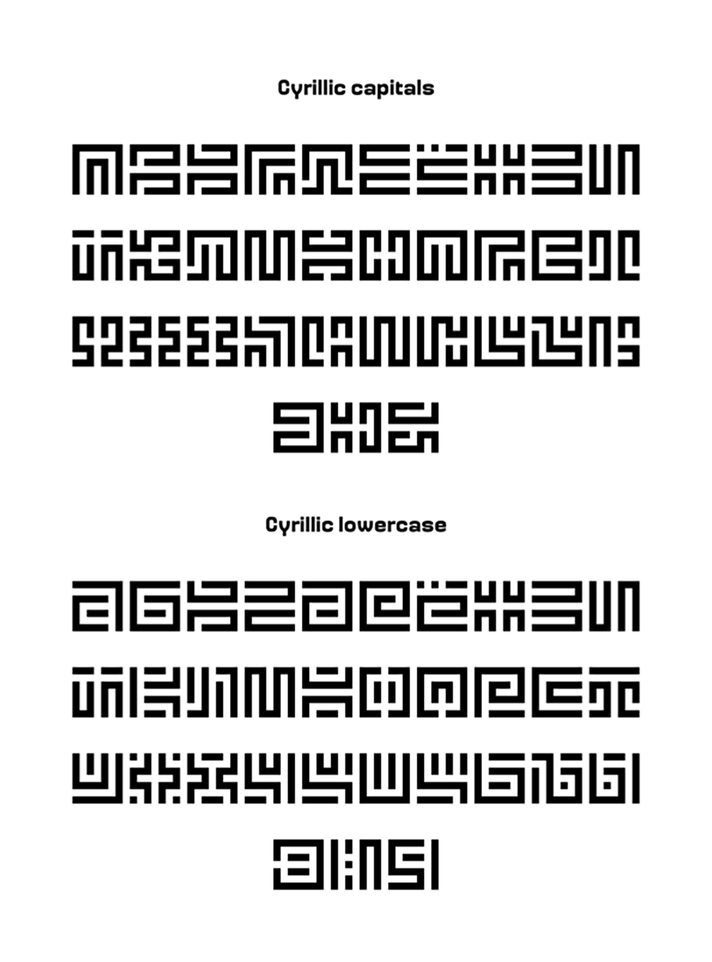
2002年,Sébastien Hayez在其原始设计师的批准下将字体改编为数字字体(多亏了他),该字体后来于2011年作为Velvetyne Type Foundry系列的一部分出版。然后,在2020年,乌克兰设计师Alex Ash (Alexander Kondratenko)提出了对字体的西里尔字母扩展,他想象了其中的大写字母。Ariel Martín Perez借此机会开发了拉丁字母和西里尔字母的小写字母(Alex Ash对西里尔字母的反馈),添加了变音符号和符号,掌握了字体,还创建了几组替代字母。
关于最初的设计,用Eric Mourier自己的话说:
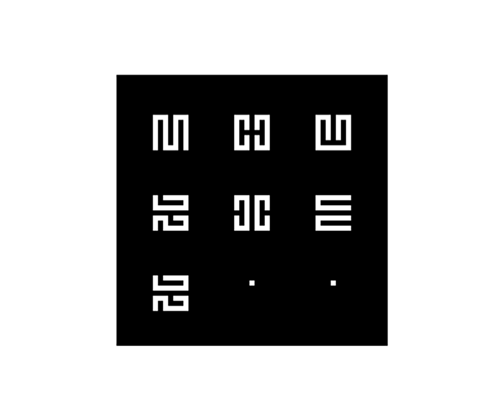
关于字体,可以说,每个字母都是根据一个严格、详细的方案设计的:四十九个正方形,黑白相间,没有封闭区域,一个正方形大小的间隙等。在这个方案中,目的是获得与“普通”字母最大的相似性,同时获得一个逻辑形式系统。举例来说,字母c和u、k和y、a和v是相同的,只是有不同的写法。
In 2002, Sébastien Hayez adapted the typeface as a digital font, with the approval of its original designer (thanks to him), which was afterwards published as part of the Velvetyne Type Foundry collection in 2011. Then, in 2020, Ukraininan designer Alex Ash (Alexander Kondratenko) proposed a Cyrillic alphabet expansion of the font, of which he had imagined the capitals. Ariel Martín Perez took this opportunity and developped lowercase letters for Latin and Cyrillic scripts (with feedback from Alex Ash for the Cyrillic), added diacritics and symbols, mastered the font and also created several sets of alternates.
About the original design, in Eric Mourier's own words:
字体风格
使用许可
本字体以SIL Open Font License 1.1(SIL 开源字型授权版本1.1,简称SIL OFL 或OFL)授权协议发布,这个授权的自由度非常高:
✔ 这款字体无论是个人还是企业都可以自由免费商用,也无需知会或者标明原作者。
✔ 这款字体可以自由传播、分享,或者将字体安装于系统、软件或APP中也是允许的,可以与任何软件捆绑再分发以及/或一并销售。
✔ 这款字体可以自由修改、改造,但修改或改造后的字体也必须同样以SIL Open Font License 1.1授权公开。
✘ 这款字体禁止用于违法行为,如因使用这款字体产生纠纷或法律诉讼,作者不承担任何责任。
✘ 根据SIL Open Font License 1.1的规定,禁止单独出售字体文件(OTF/TTF文件)的行为。
关于SIL Open Font License 1.1授权协议的内容、免责事项等详细细节,请查看详细的License授权文件的内容。
参考资料
字体来源出处:https://velvetyne.fr/fonts/mourier/